Composition in Art - How to Create Thoughtful Compositions in Paintings
One of the ways to create a visually interesting painting is by designing a thoughtful composition.
Composition refers to the way that different elements are arranged in a work of art. When we talk about a painting’s composition, we often talk about how each of the elements impacts the others around it as well as how it relates to the whole piece.
While there is no exact formula that determines or guarantees a pleasing composition, there are certain principles that can help guide an artist, such as the Rule of Thirds, the Golden Ratio, and understanding what our eyes choose to focus on.
The Rule of Thirds
The Rule of Thirds divides a composition into thirds both vertically and horizontally and suggests that the artist put their focal point on one of those lines or around one of the four intersecting points. This is based on the belief that an image is more interesting when the focus is off-center.
This idea was first articulated by the English engraver and painter John Thomas Smith in his 1797 book, Remarks on Rural Scenery. He said:
“I have found that the ratio of about two thirds to one third, or of one to two, a much better and more harmonizing proportion, than the precise formal half, the too-far-extending four-fifths–and, in short, than any other proportion whatever.” (Source)
Smith arrived at this ratio through trial-and-error. Other artists before and after have also observed uneven proportions as being aesthetically pleasing, which we can see in their body of work.
How to Use the Rule of Thirds
Vincent van Gogh intuitively used the Rule of Thirds in some of his paintings, including in Café Terrace at Night from 1889 and Fishing Boats on the Beach at Saintes-Maries from 1888.
In Café Terrace at Night, the edge of the cafe building runs along the left vertical line while the sloping roof ends on the upper horizontal line. The main focal point, arguably the standing waiter, is also close to the lower left intersection while the horizon line is just shy of the upper horizontal line.


In Fishing Boats on the Beach at Saintes-Maries, the mast of the boat closest to us in the foreground aligns with the left vertical line while the closest boat in the background, which acts as a secondary focus, lands next to the right vertical line:


The Rule of Thirds isn’t just about aligning focal points along the vertical and horizontal lines and intersections, however, it’s also about proportions in general. For example, the bodies of the boats exist within one-third of the composition while their sails and masts take up another third even though they don’t “fit” inside the initial grid that way:

Thinking about the Rule of Thirds in terms of proportions is helpful when painting subjects other than landscapes. For example, when you’re painting a bust-style portrait where it’s just someone’s head and shoulders, you’re most likely going to center them rather than put them off to the side.
Van Gogh’s Self-Portrait with Straw Hat is well-balanced in the way that his hat is in the upper third, his face occupies the middle third, and his body takes up the lower third:


In Still Life Vase with Fifteen Sunflowers, the composition is centered yet the vase measures one-third of the height of the painting and the flowers measure roughly two-thirds wide and two-thirds tall:


Mary Cassatt, who painted around the same time as Van Gogh, also used the Rule of Thirds intuitively. She more often painted intimate scenes of people rather than close-up portraits, so there was more room within her compositions to arrange figures.


In Reading "Le Figaro" above, the main focus - the woman’s face - is exactly on the upper right intersection while the secondary focus - the newspaper - is on the lower left intersection. The room is also divided by the trim, which follows the left vertical line.
In Tea below, the women’s faces (main focal points) are situated on the upper horizontal line close to the top left intersection and the tea set (secondary focal point) is on the lower right intersection:


One thing to note about portraits is that the viewer’s eye will first move to faces regardless of where they are positioned. This is demonstrated by the eye tracking experiments conducted by Alfred Yarbus:

Ilya Repin
They Did Not Expect Him
Oil on canvas
1884-1888
The blue lines are an approximation of Alfred Yarbus’ eye-tracking experiment.
Below is a Rule of Thirds chart that provides one-third and two-thirds measurements from 1 inch up to 88 inches that you are welcome to use for reference in your paintings (click on the chart to expand it):

The Golden Ratio
Sometimes called the Golden Mean or Divine Proportion, the Golden Ratio is a proportion frequently found in nature.
The Nautilus shell is considered a logarithmic spiral that expands at a ratio similar to the Golden Ratio:


In mathematical terms, the Golden Ratio looks like this:

Source: Wikipedia
B x 1.62 = A
A x 1.62 = A + B
A x 0.62 = B
(A + B) x 0.62 = A
The larger portion equals the smaller portion multiplied by 1.62. The smaller portion equals 0.62 of the larger portion.
If you’d like to better understand the math behind the Golden Ratio, check out this article.
For our purposes, the Golden Ratio can divide a composition into visually appealing sections similar to the Rule of Thirds.
In one of my paintings, Portal I, I utilized the Golden Ratio by dividing the composition in a very geometric way:


Each side of this painting measures 48 inches. From right to left, each section equals the one before it multiplied by 1.62 (i.e. 9.2 x 1.62 = 14.8 and 14.8 x 1.62 = 24 – rounded for simplicity’s sake). From left to right, each section equals the next one multiplied by 0.62 (i.e. 24 x 0.62 = 14.8 and 14.8 x 0.62 = 9.2).
In another one of my paintings, Eclipse 17, the height of the painting (40 inches) is 1.62 x the height of the sunburst shape (24.7 inches):


If we put the Golden Ratio into a grid like the Rule of Thirds, we get intersections that are closer together.
When applied to my painting, The Philosopher, the owl’s eyes are just above the upper intersections.

Below is the original painting compared with a modified version where I moved the owl down and to the left in order to align the eyes perfectly with the golden ratio. Which one do you think is more pleasing?


Personally, I feel like the increased negative space and seemingly shorter stature in the image on the right takes away from the regal quality I was trying to give the owl. So, it’s not about following the rules completely, it’s also about your intention.
If we wanted to arrange elements along the Golden Spiral, we could do something like this – the sun, several of the trees, and most of the cows land on the curve. You could take it even further by having the height of the mountains or trees correspond to the length of one of the sides of a square - or use those measurements as the distance between objects:


Below is a Golden Ratio chart that provides the 0.62 and 0.38 measurements from 1 inch up to 88 inches that you are welcome to use for reference in your paintings (click on the chart to expand it):

Composition and Scale
The impact of your composition is modified by the painting’s size.
A larger painting is like an extroverted party host – you know when you’re in the room with them and they won’t let you ignore them! A smaller painting, on the other hand, is more like an introverted party guest who is keeping to themselves.
This isn’t to say that smaller paintings can’t be impactful, but you have to get closer to them to see what’s going on.


To illustrate this idea, let’s compare two artists who painted similar subjects at the same time yet had very different approaches: Charles M. Russell and Frederic Remington.
These artists produced most of their work around the turn of the century. This was a time of great change and expansion westward in the United States. By 1869, the Transcontinental Railroad was complete and the general population had a romantic fascination with the “Wild West.” People were hungry for stories of adventure, and both artists were gifted storytellers.
Yet the artists contrasted in that Russell was self-taught and lived most of his life in Montana building relationships with his subjects and experiencing what he painted, whereas Remington, while an avid outdoorsman who spent time in the West, studied art formally at Yale and spent most of his life in New York.
Both men’s work has a sense of immediacy, with action-packed compositions occupying the middle third of their paintings. But you’ll notice more intimacy, humor, and nuance in Russell’s work and more drama and stereotypes represented in Remington’s.
Part of the intimacy of Russell’s paintings are their size. Many of his paintings are smaller. On the other hand, Remington’s paintings are generally larger than Russell’s and that larger scale adds to the sense of drama. Take his 1889 painting, A Dash for the Timber, for example:


This painting depicts a fictional scene where a group of cowboys are being chased by a group of Native Americans. It measures just over 4 x 7 feet and when you see it in person you can almost feel your adrenaline kicking in.
You have to get closer to Russell’s pieces to see what’s happening:


In Wild Horse Hunters above, cowboys are kicking up quite a bit of dust trying to wrangle a wild herd of horses. You have to get relatively close to the painting to understand the chaotic scene.
In Crow Indians Hunting Elk below, Native Americans are crouching down to move more stealthily as they stalk their prey. You can barely make out the elk in the background:
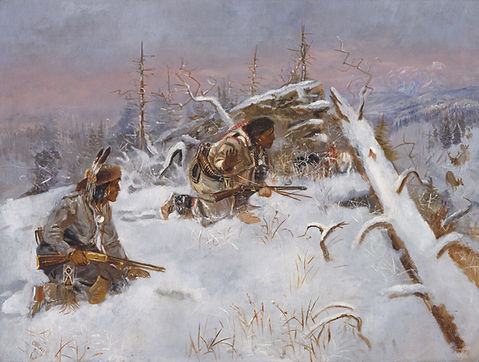

Now imagine if Crow Indians Hunting Elk was the same size as A Dash for the Timber, it’d probably feel a lot more intense. You might have a greater sense of the vastness of the landscape, and of the reality of hunting for one’s own food:

Hopefully these examples help demonstrate that it’s not just how different aspects of a composition are arranged that makes a painting balanced and interesting, the size of the painting itself has at least as much impact.
Another point that I’m trying to get at is regardless of aesthetics, our compositions are also influenced by who we are and what’s going on around us. Over time, our paintings almost start to look like us, infused with our experiences, values, and ideals. And this is something to pay attention to, because it’s basically what defines our style and makes our work identifiable.
Composition and Temperament
Another factor that influences our compositions is our temperament. I’m referring to our personality traits and moods, and especially our mental health, as that impacts what and how we paint.
If we look at paintings by the 19th century German Romantic artist, Caspar David Friedrich, we can see how his compositions shift from somewhat stiff and academic in his early pieces to more open and experiential in his later ones:

Caspar David Friedrich
Landscape with Temple Ruin
Oil
1797

Caspar David Friedrich
The Giant Mountains
Oil
1830-1835
Friedrich was initially influenced by 17th century Dutch landscape paintings, which he had access to at Copanhagen’s Royal Picture Gallery where he studied. Many of these paintings had naturally uneven proportions with low horizon lines and expansive skies, and you can see the influence of both the styles and subjects on his early work:

Salomon van Ruysdael
River Landscape
Oil on panel
1644

Jan Josefsz van Goyen
View of the City of Arnhem
Oil on panel
1646

Abraham Bloemaert
Landscape
Oil on panel
Between 1581 and 1651

Jacob Isaacksz van Ruisdael
Road through an Oak Forest
Oil on canvas
1646-1647
All of these paintings are currently part of the National Gallery of Denmark’s permanent collection, which is where the Royal Collection ended up in the late 19th century. So Friedrich could very well have studied them.
Throughout his career, Freidrich’s works were contemplative, but the subjects and mood varied. He was noted as being depressive, especially before he got married in 1818, possibly due to losing his mother and several siblings at a young age. You can see this reflected in his reference to religious symbols and cemeteries as well as use of a darker color palette, like in these paintings, Cross in the Mountains from 1808 and The Abbey in the Oakwood from 1810:

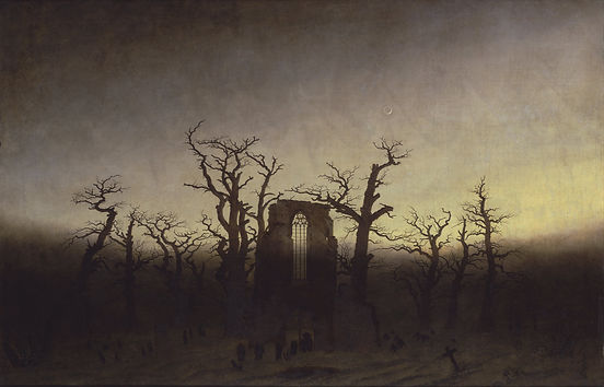
Notice how there is really only a background and foreground in these paintings. As Friedrich’s work evolved, he started including a middle ground. However, in my opinion, it’s his unique way of dividing up his compositions with a V-shape, either upright or inverted, in the foreground that defines his work more than any other design element. My sense is these peaks and valleys represent the highs and lows of his own temperament.
Another unique characteristic of Friedrich’s work is how his figure’s backs are always facing the viewer. The figures are overseeing the landscape, and we get to oversee it with them. Friedrich said that “a painter should paint not only what he sees before him, but also what he sees within himself.” Indeed, in his paintings we can see both–the beauty of nature and connection with the divine as well as an obsession with death and the passage of time.

Caspar David Friedrich
Old Heroes' Graves
Oil
1812

Caspar David Friedrich
Chalk Cliffs on Rügen
Oil
1818

Caspar David Friedrich
Wanderer Above the Sea of Fog
Oil
1818

Caspar David Friedrich
Two Men Contemplating the Moon
Oil
1825-1830

Caspar David Friedrich
Rocky Landscape in the Elbe Sandstone Mountains
Oil
1822-1823

Caspar David Friedrich
The Stages of Life
Oil
1835
The minimalist painter Agnes Martin also struggled with mental health issues. She was diagnosed as a paranoid schizophrenic in early adulthood and experienced psychotic episodes throughout her life, which she called “trances.”
The act of painting seems to have been a calming and self-regulating force. She created order with meditative grid-like patterns that often measured 6 x 6 feet like White Flower and The Islands below:


In a rare interview, Martin said that, “Artwork comes straight through a free mind—an open mind. Absolute freedom is possible. We gradually give up things that disturb us and cover our mind. And with each relinquishment, we feel better.” (Source)
She also argued that “Anything can be painted without representation,” which we can see in the elegant, if not austere, simplicity of her interpretations of nature. (Source)
Composition and Personal Values
Let’s take a look at the paintings of renowned wildlife artist Robert Bateman.
In Dozing Lynx below, the lynx is resting in the lower left corner under an ice covered tree. Bateman could have made the lynx more prominent but I’m guessing he made a conscious or unconscious decision not to.

In all of his paintings, animals are seen in the context of nature. Their surroundings and how they interact with their environment is emphasized. Perhaps he does this instinctively because he is an ardent conservationist in addition to being an artist.
Below are more examples of his work:

Robert Bateman
Alaskan Autumn - Grizzly Bears
1999

Robert Bateman
Great Blue Heron
1978

Robert Bateman
The Return - Bald Eagle Pair
Acrylic on canvas
2001
(Images used with permission of the artist)
Bateman remarked on the Bald Eagle Pair painting that when he started birding in the 1940s, there were Bald Eagle sites to visit, but by the 1960s most had been wiped out due to the widespread use of the pesticide DDT. Even though DDT was banned in the early 70s, he noted that Bald Eagles were once again being threatened by industrial fishing so he painted the male returning to the nest without food (source).
Bateman has said that his mission is to get more kids into nature with his art. He has been a member of almost 50 naturalist clubs and conservation groups and over the last few decades has donated millions of dollars worth of artwork and limited edition prints for fundraising efforts for environmental causes (source).
When it comes to compositions, Bateman himself has said that he only has one rule: “Never divide horizontally the rectangle of the composition into two equal halves.” (Source - go to 44:04 of the video.)
He starts his compositions with thumbnail sketches the size of playing cards. Over his lifetime he's accumulated so many sketches that they fill books, which he'll refer to when starting a new painting.

The Viewer’s Gaze
It’s important to pay attention to the edges of a painting as well as balancing areas with varying amounts of value, density, and detail.
In Traditional Oil Painting, Virgil Elliott suggests that compositions should attempt to bring the viewer’s eye away from the edges toward a point of interest within the painting.
“As Western civilization teaches us to read from left to right, there is a tendency for the right border of a painting to exert a certain gravitational pull on the viewer’s eye. It is therefore particularly important to avoid leading it to the right edge… Any line leading to the right edge will send the viewer out of the picture. The upper edge is likewise generally best avoided.”
Elliott argues diagonal lines are more visually interesting than vertical or horizontal lines, and curved lines in general are more interesting than straight lines. He suggests the most pleasing curved lines are “S” shapes.
He notes that with a certain degree of irregularity, parallel lines can create a compelling rhythm, such as with Velazquez’s The Surrender of Breda:

Note the lances in the upper right background. They almost create a fence and corral the viewer’s eye from exiting the painting and bring it back to the men interacting in the middle of the painting.
Another good example of bringing the viewer’s eye back into the middle of the painting would be Van Gogh’s Starry Night. The tall tree on the left (also the darkest part of the painting) and the moon on the right (the brightest part of the painting) cause the eye to play a sort of back-and-forth game of ping pong before the swirls in the sky and houses below pull us in.

Elliott refers to this kind of composition as a Steelyard Composition, where two prominent elements that are different from each other create a counterbalance as well as an engaging tension. There is a kind of harmonious asymmetry.
In Mary Cassatt’s Little Girl in a Blue Armchair, our eyes bounce between the girl and the dog both resting on chairs:

Childe Hassam’s Boston Common at Twilight is also an example of the Steelyard Composition. The dense cluster of people getting on and off the train on the left offers a counterbalance to the open field of snow on the right:

Martin Johnson Heade uses rain pouring down from clouds to bring the viewer’s eye back to the hay bales, which act as counterbalances, in Marshfield Meadows, Massachusetts:

Edgar Payne also discussed the importance of counterbalances in composition in his book, Composition of Outdoor Painting, published in 1941.
One of his suggested composition ideas is called “Balanced Scales”:

In this case, a mountain peak or towering clouds command interest in the background while balancing smaller elements in the foreground.
Other engaging composition ideas Payne suggested included the S Curve, Cross, Group Mass, and Scattered Masses:


It’s worth noting that Elliott and Payne are specifically discussing the aesthetics of traditional painting. I would argue that the more abstract a painting gets, the less relevant their suggestions are.
“Everything Everywhere All At Once” Approach
Another type of painting that does not readily abide by the rules would be a painting that has no obvious focus.
A great historical example is the work of Hieronymus Bosch. His 1490 painting, The Garden of Earthly Delights, for example, feels like a Where’s Waldo of the bizarre:

This triptych shows the Garden of Eden on the left, people engaging in free will and pleasure seeking in the middle panel, and Hell on the right. While little is known about Bosch’s religious beliefs, the composition is generally interpreted as moving in chronological order from left to right, possibly serving as a warning about the consequences of not following God’s will.
When there’s points of interest all over a realistic painting, it can feel a little cluttered if not overwhelming. In abstract paintings, however, the same is not necessarily true. Sometimes, the focus becomes more of a feeling in reaction to colors, shapes, or movement.
Below is an image of one of Gerhard Richter’s Abstraktes Bild paintings:

Where do your eyes go first when you look at this painting?
Every time I look at it my eyes start somewhere different. The composition has balance yet it’s not following any rules. If this painting was in your house, years could go by and you might notice a new detail or shape that you hadn't noticed before. For some people, this feeling of freshness along with the bold use of color makes Abstraktes Bild an attractive painting.
Below is Michelle Courier’s Stay in Your Lane #4. There’s no obvious place for the eyes to settle but the painting achieves balance via repetition, rhythm, and the colors playing off of each other.

Michelle Courier
Stay in Your Lane #4
Acrylic on canvas
2025
(Image used with permission of the artist)
You Shine Through Your Compositions
Almost no one writes by hand anymore, but when we do, our handwriting is unique. Each one of us writes with a different slant, a certain distance from the left and right margins, varying pressure, and so on.
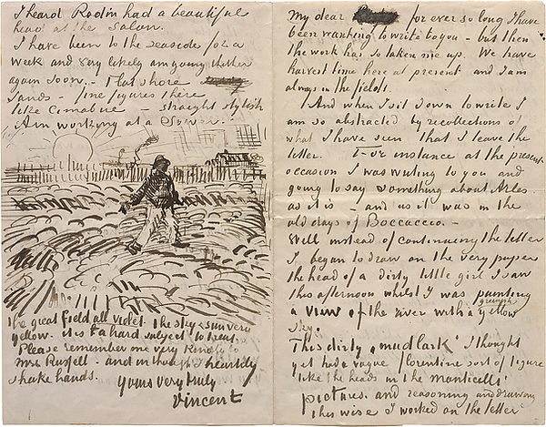
Van Gogh
Letter to John Peter Russell
Ink on paper
1888
(Source: The Solomon R. Guggenheim Foundation)
I think that artistic expression is much like our handwriting. It's just another way to use space to communicate.
We bring so much of ourselves into our paintings and just like our individual choice of colors, where we choose to place different elements in our paintings is a reflection of us. Perhaps curiosity about our natural inclination to position things and refining our particular approach will benefit our expression the most.
In sum, the "rules" and where our eyes gravitate are worth considering when putting together a composition, but ultimately, you have to play around to find a combination that brings together the various elements of your painting in an interesting way that represents you, your instincts, and your vision. The more you practice, the more intuitive the process will become!
I hope this information was helpful. If you’d like to see more demos, subscribe to my YouTube channel or check out the other articles on my site here.